 You begged us. You pleaded, groveled, and implored. And like a djinn, your lords at Angry Metal Guy listened, and relinquished, giving the unruly masses what they truly craved: an album art top ten. But like a truly evil djinn, your spell was twisted. Instead of a carefully curated, agreed upon list from the full staff, management saw it fit to give me sole power over this utmost important competition! Now, I am not saying this will go to my head, but this of course means that all of you peasants will bow down before me and declare me… Furious Art Maestro.
But what makes good art? It’s a never-ending question that I will certainly not solve in the equivalent of three sheets of letter paper. Yet, there are some distinctly separate qualities I can discern, scrolling across the more than 700 pieces of art adorning the albums reviewed this year, attempting to filter out the favorites. Use of color and contrast, positioning on the canvas, distinct art styles, and an often overlooked quality called readability that simply means “Can I see what it is right away?” Additionally, there’s a handful of useful litmus tests, like a plus if the art would make a cool tattoo, or a demerit if your grandma would say it would make a cool tattoo.
But after knocking the 700+ album covers down to over 35, at some point you just have to go with your gut. Because if there’s one thing more subjective than our musical end of year lists, it’s gonna be this article, and I fully expect an enormous shitstorm to brew in the comments below. Fights may break out about what album covers did not make the grade, the ones that did, their places in the list, the argumentation for their selection, and the fact you must now call me Furious Art Maestro. So read and weep, argue and bicker. But most of all, enjoy the wonderful artworks adorning some of our favorite albums this year.
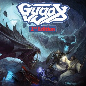 #(ish): Gygax // 2nd Edition (artist: Rachel Deering) – Although theme bands are often derided as gimmicks, there’s been a few real class acts among the bunch, and Gygax is ahead of the pack. Well, if you’re gonna have a theme, do it right, right? The Dungeons & Dragons subject of the band is extrapolated perfectly to the packaging, with a dynamic cover that perfectly captures the art of the old school Player’s Guides. The color palette has an appropriate fade, the framing of the beast and the player characters keeping the feel of the cover lively. Even the framing and type-facing of the logo and album title are in line with old school D&D manuals. A good example of minding all the details!
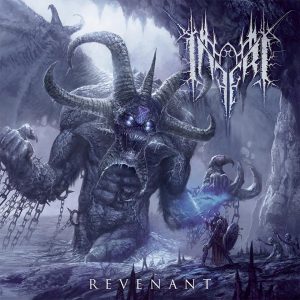 #(ish): Inferi // Revenant (artist: Helge c. Balzer) – Giant beasts looming over tiny humans is a setup used again and again across all visual art, and this year no one did it quite as well as Inferi. The huge, imposing demon, complete with Lucifer’s Sigil and eight-pack abs, is rendered in exquisite detail, the motion and power immediate and intimidating. The sense of scale is the strongest asset of this cover, using both regular and atmospheric perspective to give a sense of the creature’s size, and the imposing result speaks for itself. Only the rather flat coloring keeps this back from a spot beyond the ish.
 #10. Gaia // Aerial (artist: Barnaby Oakley) – Speaking of color use, Barnaby Oakley nailed that aspect of his cover for Gaia’s Aerial. The only album here with a score from the bottom half of the scale, Aerial is a lot more fun to look at than listen to. The planet in the clouds, the cinder-strewing phoenix, the sunset-stricken background, all in vibrant watercolors whose color pops right off the canvas. The surrealist composition of its two subjects only makes it more alluring. I merely wish more had been done with the background, but other than that this is a beautiful painting and too good for the album it graces.
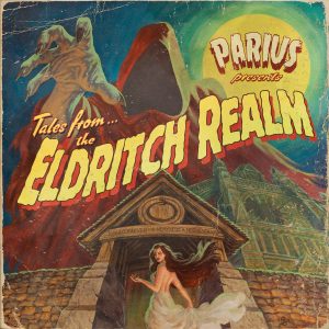 #9. Parius // Tales From the Eldritch Realm (artist: Stephen Andrade) – Returning to the theme of themes, Parius knocks it out of the park with this retro cover from Stephen Andrade. Everything here lives and breathes love for pre-50’s movie posters, from the rich yet subtly muted color palette and the smart composition (mind the distorted perspective!) to the exquisitely retro lettering, the entire picture feels like something that could be hanging in an old cinema, down to the little scratches and folds around the edges and corners. All the puzzle pieces fall into place here.
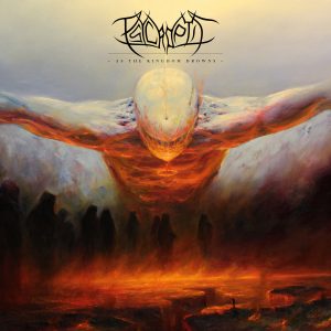 #8. Psycroptic // As The Kingdom Drowns (artist: Mariusz Lewandowsky) – There are few words as vague a praise as ‘evocative,’ yet its the word I keep coming back to when looking at this cover. The centerpiece is the mountainous, looming figure, arms spread like Christ, lit in the stark contrasts of heavenly blue from above and hellfire red from below. The composition and use of color leave much to the imagination, such as to the nature of the monoliths that stand gathered like cultists or the tiny, insignificant figure at the foot of the cliff below. A picture is a thousand words they say, but the cover of As The Kingdom Drowns suggests a novel full of inspiration.
 #7. Sigh // Heir to Despair (artist: Eliran Kantor) – As much of a bizarre, overwrought and in-your-face of an experience Sigh can be, so subtle is the album art of Heir to Despair. Had it only been an almost Vermeer-esque naturalist painting, it might not have made much of a dent. But here, the devil is literally in the details. The flowers wilting and dying as they receive water is obvious, but the ominous shadow down the hall? The collage of noir-style thread-connected photos? Crumpled paper airplanes lining the floor? With such subtle visual cues, Kantor hints at the disturbing madness behind his subject’s smile.
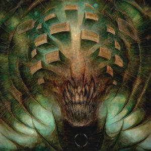 #6. Horrendous // Idol (artist: Brian Smith) – But with everything in favor of subtlety, there is still an art to shocking immediacy, and Brian Smith does this with horrific beauty on the cover for Horrendous’ Idol. The grinning, eyeless, Mouth of Sauron-looking figure is some of the most unnerving imagery of the year. More than gore and hellscapes, this cover addresses the primal fears of the uncanny and the cosmic, a creature possibly humanoid yet evoking the unknowability of cosmic horror. In all its glorious detail, with the background light providing contrast for the grotesque head, there is no getting around the foul grimace.
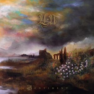 #5. Un // Sentiment (artist: Cauê Piloto)- Desolate landscapes are a staple among metal covers, and I’ve axed many such artworks from this very list. But the problem with truly desolate landscapes is that they are often boring and monochromatic. This is where Un stands out. The cover for Sentiment uses color and contrast cleverly, the ruins in the distance stark against the brightness of the sky beneath the clouds, the colorful bed of flowers in the foreground breaking up the dark earth and grass. The watercolor streaks of various shades against the sky complete the picture, evoking the album’s namesake emotion expertly. Ultimately, Cauê Piloto’s artwork succeeds because of its thematic contrast foremost: the lonesome desolation in the distance against the flowers of hope in the foreground.
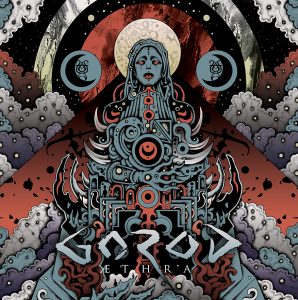 #4. Gorod // Aethra (artist: Jeff Grimal) – If there was a prize for the most insular style of cover art, Jeff Grimal might have won it with the semi abstract angles of Aethra. The totemic figure and its background are nigh-completely symmetrical, and the illustration creates the illusion it was constructed from countless layers stacked together. But the strength of Grimal’s artwork lies in the innumerable shapes and details these layers form, creating a genuine lost feeling as you scour the many intricacies. Some of you might still be surprised at finding humanoid silhouettes among the layers and folds, or to find where the symmetricality unexpectedly holds up, or just as unexpectedly breaks down. The entire structure feels like an intricate puzzle as well as a genuinely pleasing composition. Not unlike the album it adorns.
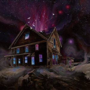 #3. Ancestors // Suspended in Reflections (artist: Nicole Momaney) – Mysteriously glowing buildings are both a strong visual and a cliché. But whereas this usually means green beams and suggestions of alien abduction, Nicole Momaney went in another direction for Ancestors’ Suspended in Reflections, and the result is perhaps the most striking use of color and contrast this year. The highly detailed building harbors a scintillating, supernatural glow, organic and strange, in alluring swirls of color, outlined brilliantly against the nighttime darkness of the building. Additions like the swirling mist and white birds deepen the mystery, tickling the imagination. Momaney used the horror cliché and turned it into something wondrous and inventive, gorgeously executed.
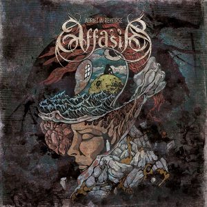 #2. Affasia // Adrift in Remorse (artist: Costin Chioreanu) – One of the major modern stars in metal artwork is Romanian artist Costin Chioreanu, whose surreal, illustrative style with thick, coarse strokes has adorns literally hundreds of albums, as well as a number of music videos. But his best work this year is easily the breathtaking cover for Adrift in Remorse. The layout draws the eye into a spiral, from the frozen face and the mountaintops to the grasping hand, to the sea and the open door, and the pensive silhouette contained within. The composure is stunning, yet restless, never letting the eye remain still as it is drawn back into the spiral. Combined with the stark, minimal colors and stern subjects, this piece of art invites to be stared at for hours on end.
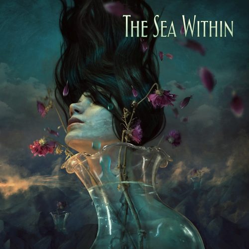
#1. The Sea Within // The Sea Within (artist: Marcela Bolivar) – My favorite album art of the year is among the least stereotypically metal on the list. It uses soft tones instead of harsh contrasts and round, fluid shapes instead of barbed angles. Its female figure is not dead and rotting away with the tits magically preserved. Yet Marcela Bolivar’s painting is immediately, undeniably striking. Part of my preference for this picture can be traced to my admirance for Salvador Dali’s work, as the art for The Sea Within displays similar control over the surreal, with its subject’s subtle deformation, as well as the sense of dynamics. Bolivar’s imagery is a flurry of motion, captured in beautiful colors and contrasts, using a simulated field of depth to increase the sense of dimension throughout the painting. The fantastic imagery and flawless execution win The Sea Within the very first Angry Metal Guy Album Art o’ the Year.
Special Achievements
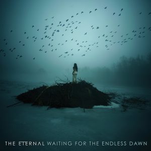 Best Photography: The Eternal // Waiting For the Endless Dawn (artist: Bairon Rivera for Barnel Photography) – While my favorite covers are generally paintings and illustrations, photography is an entirely different skill. Many albums using photos as covers are uninspired pictures of the band, or chosen for historical significance. The Eternal went in another direction with “New Dawn,” a beautifully arranged monochromatic shot of a surreal scenery, taken by Bairon Rivera. The perfectly centered woman looks small and vulnerable in the cold wilderness, yet a sense of wonder pervades the picture as a flock of birds takes flight. A haunting and melancholic image, perfectly chosen for The Eternal’s music, this was the best photo on a metal cover this year.
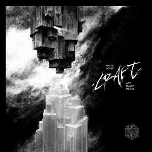 Best Black & White: Craft // White Noise & Black Metal (artist: Zbigniew Bielak) – Nearly everyone sees the world in full color (monochromacy, or full color blindness, is extremely rare.) It stands to reason that color illustrations are generally more popular than black and white. But there is a special art to black and white drawing, because its limitations demand creative solutions. Polish artist Zbigniew Bielak is that creative, as shown with the cover for Craft’s album this year. It takes the theme of its color scheme literally: the mirrored geometric shapes, resembling buildings, not only use solely black lines or white lines, but they contrast gleaming office blocks with dark urban decay in their texturization. This polarization is at the heart of the artwork, the shining facade with the grimy darkness underneath. A beautiful use of the medium and deserving of the best black and white art title.